No Time for Times
Too long has the world suffered with Times Roman: it's a miserable font though, perhaps, okay for beginners doing newsletters which have tons of material crowded into a small space. That's right. Times Roman for all practical purposes is a condensed font; and it's not only condensed in the traditional manner (horizontally) but also vertically.
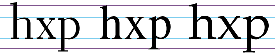
For sure, we have all read again and again that Times has a large x-height (the measure of lowercase characters via the height of the letter "x").
Nonsense!
The only reason that it has a large x-height is because its ascenders and descenders have been chopped short, as shown below: it's "large" x-height is only apparent.
Now, while 15 percent may not seem like much, it is also the difference between being elegant and being squat, so ask yourself: Do you really want to go out into the world and look like a lump?
Copyright © 1997, 1996, by Chet Gottfried.
Look Out! | Web & DTP | Contact